Microsoft’s new default font options, rated – TechCrunch
Calibri, we hardly knew ye. Microsoft’s default font for all its Office products (and built-in apps like WordPad) is on its way out and the company now needs your help picking a new one. Let’s judge the options!
You probably don’t think much about Calibri, if you think about fonts at all, but that’s a good thing in this context. A default font should be something you don’t notice and don’t feel the need to change unless you want something specific. Of course the switch from Times New Roman back in 2007 was controversial — going from a serif default to a sans serif default ruffled a lot of feathers. Ultimately it proved to be a good decision, and anyway TNR is still usually the default for serif-specified text.
To be clear, this is about defaults for user-created stuff, like Word files. The font used by Microsoft in Windows and other official brand things is Segoe UI, and there are a few other defaults mixed in there as well. But from now on making a new document in an Office product would default to using one of these, and the others will be there as options.
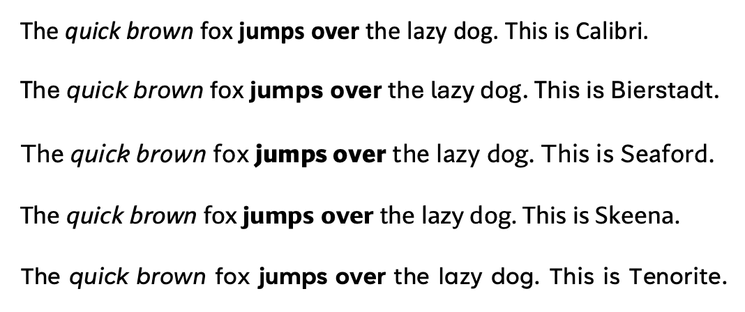
Replacing Calibri with another friendly-looking universal sans serif font will be a considerably less dramatic change than 2007’s, but that doesn’t mean we can’t have opinions on it. Oh no. We’re going to get into it. Unfortunately Microsoft’s only options for seeing the text, apart from writing it out in your own 365 apps, are the tweet (doesn’t have all the letters) or some colorful but not informative graphic presentations. So we (and by we I mean Darrell) made our own little specimen to judge by:
 You may notice Grandview is missing. We’ll get to that. Starting from the top:
Calibri, here for reference, is an inoffensive, rather narrow font. It gets its friendly appearance from the tips of the letters, which are buffed off like they were afraid kids might run into them. At low resolutions like we had in 2007 this didn’t really come across, but now it’s more obvious and actually a little weird, making it look a bit like magnetic fridge letters.
Bierstadt is my pick and what I think Microsoft will pick. First because it has a differentiated lowercase l, which I think is important. Second, it doesn’t try anything cute with its terminals. The t ends without curling up, and there’s no distracting tail on the a, among other things — sadly the most common letter, lowercase e, is ugly, like a chipped theta. Someone fix it. It’s practical, clear and doesn’t give you a reason to pick a different font. First place. Congratulations, designer Steve Matteson.
Tenorite is my backup pick, because it’s nice but less practical for a default font. Geometric sans serifs (look at the big fat “dog,” all circles) look great at medium size but small they tend to make for weird, wide spacing. Look at how Bierstadt makes the narrow and wide letters comparable in width, while in Tenorite they’re super uneven, yet both are near the same total length. Also, no, we didn’t mess with the kerning or add extra spaces to the end in “This is Tenorite.” That’s how it came out. Someone fix it! Second Place.
Skeena, apart from sounding like a kind of monster you fight in an RPG, feels like a throwback. Specifically to Monaco, the font we all remember from early versions of MacOS (like System 7). The variable thickness and attenuated tails make for an interesting look in large type, but small it just looks awkward. Best e of the bunch, but something’s wrong with the g, maybe. Someone might need to fix it. Third place.
Seaford is an interesting one, but it’s trying too hard with these angular loops and terminals. The lowercase k and a are horrifying, like broken pretzels. The j looks like someone kicked an i. The d looks like it had too much to eat and is resting its belly on the ground. And don’t get me started on the bent bars of the italic w. Someone fix it. I like the extra strong bold and the g actually works, but this would really bug me to use every day. Fourth Place.
Grandview didn’t render properly for us. It looked like Dingbats in regular, but was fine in bold and italic. Someone fix it. Fortunately I feel confident it won’t be the next default. It’s not bad at all, but it’s inhuman, robotic. Looks like a terminal font no one uses. See how any opportunity there is for a straight line is taken? Nice for a logo — feels strong structurally — but a paragraph of it would look like a barcode. Use it for H2 stuff. Last place.
So what should you “vote” for by tweeting hard at Microsoft? Probably it doesn’t matter. I’m guessing they’ve already picked one. Bierstadt is the smart pick, because it’s good in general while the others are all situational. If they would only fix that damn e.
The post Microsoft’s new default font options, rated – TechCrunch appeared first on Chop News.
from Chop News https://ift.tt/3vt03rf
Comments
Post a Comment